The hamburger menu has become a best practice to provide access to the main menu of the website while viewing it on a small screen size. The hamburger menu could be considered a consistent entry point to the navigation and could be applied even on non-mobile viewports. The issue with this however is that the burger does not allow the user to scan the available menu items in first view. Especially in E-commerce website, this interface cleanness might not be the right solution.
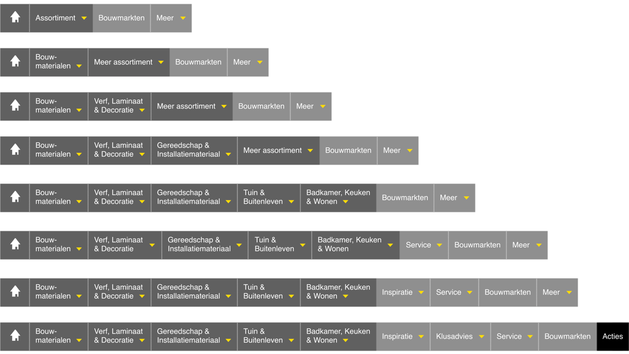
The various breakpoints of the Praxis navigationThe solution for this is a true responsive menu. This means some investment to design and develop more than just two (or one) breakpoints, but it should be optimised for multiple breakpoints. The mechanic behind this is that the "more" element is introduced whenever other navigation elements don't fit anymore. The elements that drop-off first are the least important ones and will be accessible thru the "more" element. Clicking this will simply show a sub-navigation wil all of the "hidden" items at that time. Even when there are two section in the menu (like various categories ànd a promotion section) you still can apply this.
This solution combines a scannable and a responsive navigation at the same time; "More" is the scannable hamburger.