Early februari 2013 I read about a UX concept that was implemented in an application called Layervault. The designteam introduced “Progressive reduction” to secure a minimalist design while at the same time helping first time users in their onboarding process. The service focuses on optimising the “First Time User Experience” (FTUE) by making the interface adapt to the specific proficiency level of the user. When the user regularly uses the application the visual presentation of basic interface elements slightly become more minimalistic so the users attention is automatically drawn to new features that have come more relevant now the users skill level has increased.

There are some basic examples that vary the presentation of the button, the icon or the label, but besides these small tweak it has not been widely adopted. The reason for this, I think is that it’s only relevant when your audience uses your product for a longer period. If they check you app daily, it’s important to micro-manage your interface, but in most cases, you don’t have that dedication from your users.

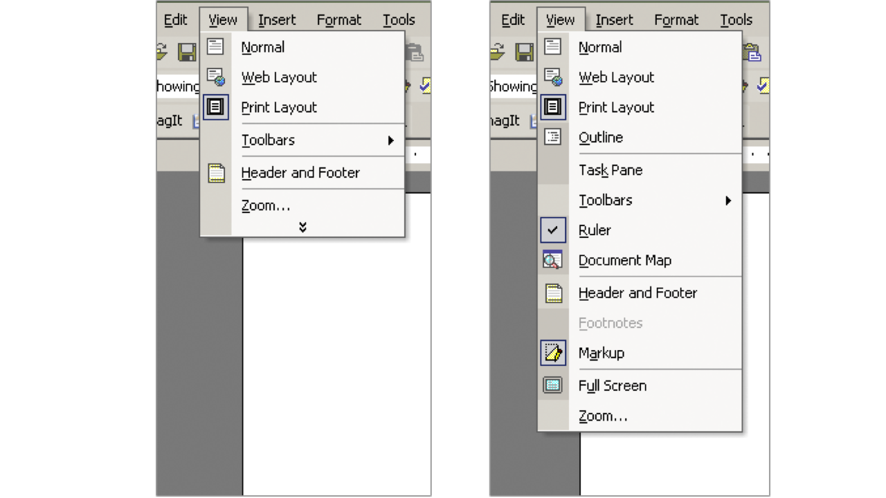
When applied it’s crucial to get the dosage right. If the change is too big, users might get confused. People don’t like change, they want familiar design so they can understand how the interface works. MS Office (2003) has experimented with reshuffling the menu-items so rarely used options would be out of your way. The idea was good only the changes made to the interface were too significant and could not be predicted, so users didn’t like it. Later in 2007 MS Office dropped the concept, but that doesn’t mean we should not optimise towards a smarter interface; we should just do it slowly.
An example to effectively implement Progressive reduction is to make the logo of the website dynamic. When a user visits a website for the first time; the user needs confirmation that he’s on the right page, therefore the logo needs to be more prominent. After the first minutes of his visit, the user knows exactly where he is, so from a functional standpoint the brand presence has become less relevant and so the logo could be presented smaller to give more focus to other elements.
Maybe, because the digital world changes so rapidly, this concept will never be a trending pattern. There might not be enough time to improve the user experience on such a detail level. A new feature or redesign is always nearby, making the subtle tweaks irrelevant. Nevertheless it’s still an interesting concept worth investigating and I still believe in the potential of “Progressive Reduction” because it enables a minimal, simple and friendly interface by adapting to the customer journey. Let’s see if more relevant examples arise in the coming year.